

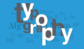
Typography plays a critical role in the effectiveness of display ads. It impacts readability, brand recognition, and user experience. Choosing the best fonts for display ads can significantly increase engagement by ensuring your message stands out and is easily understood. Poor font choices, however, can make your ad difficult to read or unappealing, leading to a missed opportunity.
In this blog, we’ll explore the best fonts for display ads, discussing how typography can elevate your ad’s performance and appeal. We’ll also share tips for selecting the ideal fonts and best practices for optimal readability.
Why Typography Matters for Display Ads
Typography isn’t just about picking a pretty font; it’s about creating an experience for the user. Here’s why it matters:
- Readability: Fonts need to be clear and easy to read at any size. When designing display ads, your audience should be able to digest the message quickly.
- Brand Identity: Typography helps reinforce your brand’s identity. The right font can express your brand’s tone and personality, creating a strong first impression.
- User Engagement: Good typography enhances user experience. It directs attention, creates hierarchy, and emphasizes important messages like calls-to-action (CTAs).
Best Fonts for Display Ads: The Key Players
1. Helvetica Neue: Timeless and Clean
Helvetica Neue is one of the most versatile sans-serif fonts. Known for its clean lines and neutrality, it’s widely used in digital advertising. This font works well in various ad formats, offering legibility and simplicity. Whether you’re showcasing a product, offering a service, or sharing a promotion, Helvetica Neue ensures clarity without distracting from the message.
Best Use: Ideal for corporate, tech, and minimalist brand campaigns.
2. Montserrat: Bold and Contemporary
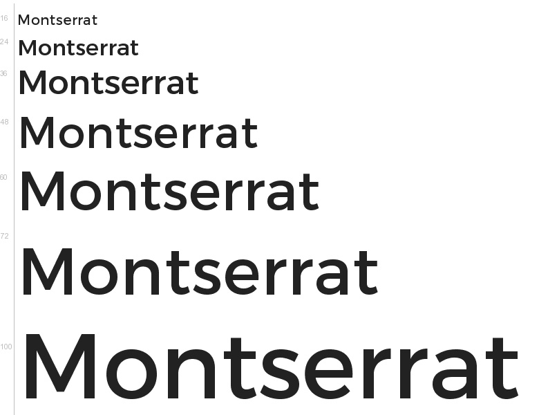
Montserrat is a bold, modern sans-serif font with geometric shapes that stand out, making it perfect for display ads that need to grab attention. Its strong visual presence makes it an excellent choice for headlines, CTAs, and any part of the ad where you need to highlight key information. Montserrat’s unique style works well in both large banners and mobile ads.
Best Use: Perfect for fashion, lifestyle brands, and any ad requiring a bold impact.
3. Roboto: Modern and Readable
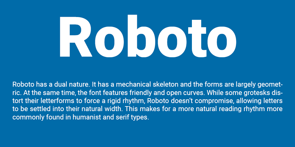
Roboto is a widely used sans-serif font that balances modernity and readability. With its clean lines and slightly rounded edges, it provides an approachable feel while maintaining professionalism. This font is highly legible even on smaller screens, making it a top choice for responsive ads. It’s versatile enough to be used for both large headings and smaller text in display ads.
Best Use: E-commerce, tech, and professional services that want a friendly but reliable tone.
4. Open Sans: Clean and Optimized for the Web
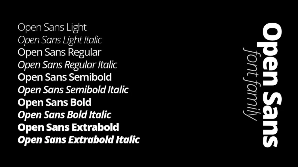
Open Sans is one of the most popular web fonts because it’s designed for legibility and accessibility. It works well in both print and digital mediums, ensuring your message is clear regardless of where the ad is displayed. Open Sans has a slightly larger x-height, making it easier to read on smaller screens and in fast-scrolling environments.
Best Use: Great for health, wellness, and educational brands that prioritize accessibility.
5. Lora: Elegant Serif Option
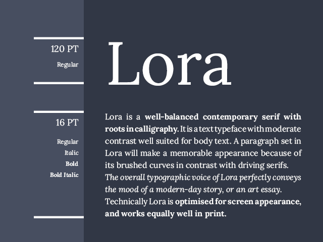
While sans-serif fonts dominate digital advertising, serif fonts like Lora offer an elegant and professional touch. Lora’s balanced proportions and elegant design make it a great choice for luxury brands or ads that want to convey a sense of authority and trustworthiness. It’s ideal for both headlines and body text, providing versatility and readability.
Best Use: Perfect for high-end brands, real estate, and financial services.
Tips for Choosing the Best Fonts for Display Ads
Now that we’ve covered the best fonts for display ads, here are some tips to help you make the best choice for your specific campaign:
1. Prioritize Readability Over Style
While fonts with unique and decorative elements can be visually appealing, clarity should always come first. Your display ad should be easy to read within seconds. Choose fonts that don’t compromise legibility, especially in smaller sizes. Simple, well-designed fonts often work best in high-traffic, fast-paced environments like display ads.
2. Limit Font Variety
Overusing different fonts can overwhelm the viewer and detract from the ad’s focus. For clarity, choose one font for the headline and a complementary one for body text, or stick to a single font with various weights and styles. This ensures your display ad remains clean and visually harmonious.
3. Use Contrasting Fonts for Emphasis
Highlight key elements, such as your call-to-action (CTA), by using a contrasting font or weight. For example, pair a bold, attention-grabbing font for your headline with a more subtle one for supporting text. This helps guide the viewer’s attention to the most important parts of your display ad.
4. Ensure Mobile Compatibility
With more users engaging with display ads on mobile devices, it’s essential to select fonts that render well on smaller screens. Fonts like Roboto and Open Sans are optimized for both desktop and mobile, ensuring a consistent user experience across devices.
5. Test Your Font Choices
It’s always a good idea to A/B test your font choices to see how different fonts affect performance. Try running ads with varying typography to determine which fonts lead to higher engagement, conversions, and click-through rates.
How Typography Aligns with Your Brand
Your typography should always align with your brand’s personality and message. The font you choose can reflect your brand’s tone—whether it’s professional, playful, sophisticated, or friendly. Here’s how to make sure your typography aligns with your branding:
- Know Your Brand’s Voice: Choose fonts that complement the overall tone of your brand. For example, a tech company may prefer modern, clean fonts, while a luxury brand may gravitate toward elegant, serif fonts.
- Maintain Consistency: Consistency is key in branding. Ensure that the fonts used in your display ads are in line with your website, social media, and other marketing materials. This builds brand recognition and trust.
- Consider Your Audience: Think about who you’re targeting with your ads. For example, a playful font may work well for a young, creative audience, while a more traditional font might be better for professional services or corporate brands.
Conclusion
Choosing the right fonts for display ads is crucial for engaging your audience, communicating your message effectively, and boosting conversions. Fonts like Helvetica Neue, Montserrat, and Roboto offer clear, professional typography that works well across a variety of ad formats and industries.
By prioritizing readability, testing your choices, and aligning fonts with your brand, you can create display ads that not only look great but drive results. Whether you’re launching a campaign for a tech brand, an e-commerce store, or a luxury service, the right typography can make all the difference in the success of your ads.


Leave a Reply